Interiors matter – a truism that takes on a new dimension in the context of commercial space design. Restaurants, offices, hotels, and showrooms are places that not only serve practical purposes. They communicate . They create atmosphere, strengthen the brand, influence emotions, purchasing decisions, and well-being. And one of the most powerful, yet often underestimated, tools in an interior designer's arsenal is color .

Color determines the first impression
Research conducted by Colorcom and the University of Southern California (USC) has shown that 62 to 90 percent of a person's first impression of a product, space, or brand is determined by color. Importantly, this assessment is formed instantly— in just 90 seconds from the moment of first visual contact (source: Colorcom Research , Satyendra Singh, "Impact of color on marketing"—Management Decision, 2006 ).
This means that the interior's color scheme—even before a customer enters, speaks with staff, or uses a service—serves as the brand's first message . It is color that builds the emotional context of a place: it can evoke trust, anxiety, curiosity, or distance. Moreover, this first impression often shapes the overall experience of the visit —even if other elements (service quality, ergonomics, offerings) are excellent.
Color, therefore, serves not only as an aesthetic tool but, above all, as a perceptual filter —determining whether a user will even enter, stay, or use a product or service. In commercial spaces—hotel lobbies, showrooms, restaurants, or boutiques—it is often a key element of both image and functional strategy.
Blue – the color of confidence, concentration and efficiency

The color blue has long been associated with a sense of security, peace, and clarity of thought. Psychological and neuroscientific research indicates that shades of blue have a real impact on the nervous system : they help lower cortisol levels (the stress hormone) , regulate circadian rhythms, and improve the ability to concentrate .
In the workplace, this color proves particularly effective. Experiments conducted by the University of British Columbia showed that people working in rooms decorated in blues and cool grays perform better in tasks requiring concentration and precision than those working in environments such as red or yellow ( Mehta & Zhu, 2009 ).

One of the most compelling pieces of evidence for blue light's potential is the use of so-called blue-enriched lighting in office spaces. A study conducted by scientists from the University of Basel and published in Sleep and Biological Rhythms (2014) found that exposure to blue light during the day increases alertness, reaction time, and well-being , while not disrupting sleep at night , if properly designed.
In Japan, blue LED light in public spaces (e.g. train stations) was implemented as part of the fight against depression – and brought concrete results: an 84% reduction in the number of suicide attempts on the platforms covered by the program ( Matsubayashi et al., 2013, Journal of Affective Disorders ).
In interior design, this means that blue—whether in the color of walls, upholstery, or details, or in appropriate lighting—is an excellent choice for offices, coworking spaces, conference rooms, or consultation spaces . It helps calm emotions, facilitates concentration, and supports the user's mental well-being—regardless of their role.
Red – intense stimulation, shorter reaction time, faster decisions

Red is one of the most powerful colors in the entire spectrum – it strongly stimulates the senses, increases muscle tension, and accelerates the heart rate. In color psychology, it is considered an energetic, activating, and emotionally charged color. Research on time perception shows that people in a predominantly red environment tend to overestimate the duration of events , which in practice means that time seems to pass faster ( Ali, S., & Peebles, D. (2013). “The Influence of Color on Time Perception” – i-Perception ).

Commercial interior designers often take advantage of this effect, especially in spaces where rapid occupant turnover and impulsive decision-making are key. A study published by the University of Rochester found that exposure to the color red improves physiological reactivity but reduces cognitive task performance . Therefore, it works well as a stimulating accent, but shouldn't dominate the entire interior ( Elliot & Maier, 2012, Psychological Science ).
In environments such as fast-casual restaurants, self-service cafes, impulse shops, and food courts, red in the form of accessories (e.g., upholstery, wall art, lampshades) increases the pace of consumption and reduces the time spent at the table . On the other hand, in excess, it can lead to mental arousal bordering on anxiety.
Marketing research conducted by the Journal of Hospitality & Tourism Research (Bellizzi & Hite, 1992) shows that too intense red in points of sale can reduce the customer's psychological comfort and sense of control , which may be undesirable in high-brand or aspirational venues.
Therefore, in interior design practice, red should be treated as an instrument of precise stimulation – it works best in small doses, in a specific functional context. It is a color that attracts the eye, evokes emotions, and drives decisions – when used consciously and in moderation.
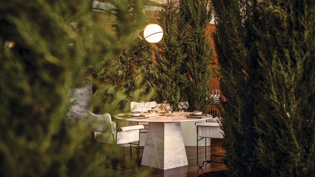
Greenery – a natural stress regulator and support for mental well-being

The color green – especially shades associated with vegetation and natural landscapes – has a proven effect on regulating emotions, reducing stress, and restoring psychophysical balance . Research conducted by University of Exeter Medical School has shown that people who have regular contact with greenery (both natural and artificially introduced indoors) show lower levels of cortisol – the stress hormone – and higher levels of life satisfaction ( White et al., 2013, "Nature and mental health", Psychological Science ).

Interestingly, this effect isn't limited to real nature. Experiments in environmental psychology show that the mere presence of green in a space—e.g., on walls, fabrics, or furniture—can elicit physiological responses similar to those experienced during contact with nature. A study published in Frontiers in Psychology (2015) demonstrated that exposure to green office spaces positively impacts attention, mood, and subjective well-being ( Jiang et al., 2015 ).
Greenery works by stimulating the prefrontal cortex and parasympathetic nervous system, responsible for relaxation and emotional control. This makes it particularly beneficial in spaces where we expect calm or tension relief – such as hotel lobbies, waiting rooms, open-plan offices, and coworking spaces .
Greenery gains additional power when combined with other biophilic elements, such as potted plants, natural light, wood, and organic materials . This type of environment not only positively impacts mood but also enhances creativity and cognitive performance – as confirmed by research from the University of Queensland: productivity in offices with plants increased by 15% compared to spaces without greenery ( Knight & Haslam, 2014 ).
The implications for interior design are clear: green is not just a color—it's a well-being strategy that fosters a sense of security, balance, and regeneration. In commercial spaces, it can truly enhance the perception of a place and the brand experience.
Yellow and orange – the colors of creativity, energy and emotional engagement

Colors in the warm spectrum—primarily yellow and orange —are strongly associated with positive emotions, cognitive stimulation, and creative thinking. In color psychology, yellow is considered the color of joy, optimism, and energy , while orange is the color of sociability, spontaneity, and creative expression .
Research conducted by scientists from the University of Texas and the Vrije Universiteit Amsterdam has shown that rooms with accents of yellow and orange increase nervous system arousal and beta-wave activity in the brain , which correlates with heightened alertness and a tendency to engage in creative tasks ( Kwallek, Lewis, & Robbins, 1988; Mehta & Zhu, 2009 ). Furthermore, a study published in Color Research & Application showed that yellow can increase levels of dopamine , a neurotransmitter associated with pleasure, motivation, and the ability to learn ( Wright et al., 2007 ).

In design practice, this means that yellow and orange are perfect for spaces that require creativity, collaboration and a positive atmosphere : workshop rooms, co-working zones, educational spaces for children and teenagers, and reception areas where openness and a friendly atmosphere are important.
It's worth remembering, however, that these colors—due to their intensity and visual temperature— can easily dominate a space . Excessive amounts of yellow or saturated orange can overstimulate the nervous system , manifesting as distraction, anxiety, and irritability. Environmental psychology studies have found that people who spend too much time in bright yellow interiors report feelings of fatigue and anxiety (*Walch et al., 2005, The Journal of Nervous and Mental Disease ).
Therefore, these colors are best used as accents – in upholstery, wall graphics, small details, or interactive zones. Complemented by a neutral background and appropriately selected lighting (e.g., daylight or a color temperature of 4000–5000K), they create a space that motivates, inspires, and encourages action , without overloading the senses.
Neutral colors – timeless elegance, balance and a backdrop for meaning

Neutral colors—such as white, gray, and black —are the foundation of contemporary interior design, both residential and commercial. While they may seem "safe," their role is much more complex. They not only visually organize a space but also create an emotional framework that influences the perception of a place and the user's interaction with its surroundings.

White – brightness, order and… distance
White has always been associated with purity, freshness, and perfection . In interior design, it has a visually enlarging effect, reflecting light and opening up space—making it a natural choice for reception areas, showrooms, and minimalist boutiques. However, research published in the Health Environments Research & Design Journal has shown that all-white interiors can evoke feelings of cold, isolation, and excessive sterility in users ( Jiang et al., 2016 ). For this reason, designers often combine white with natural materials (wood, fabrics) to soften its distancing effect .

Gray – balance, flexibility and emotional neutrality
Gray, in shades ranging from light ash to deep anthracite, acts as an emotional neutralizer —stabilizing a space and allowing other colors to shine through. In a study published in Color Research and Application , participants rated gray interiors as professional and conducive to concentration , provided warming elements (e.g., warm-colored lighting) were present ( Elliot & Maier, 2014 ). Gray works well in offices, hotels, and retail spaces, which require a subtle yet consistent setting.
Black – power, prestige and drama
Black is a color with strong symbolism – in color psychology, it is associated with authority, luxury, and intimacy . Used as an accent or background, it adds depth, sharpens contours, and can create an aura of exclusivity. Neuromarketing research shows that luxury brands that use black in their physical spaces are more likely to be associated with high quality, durability, and social status ( Labrecque & Milne, Journal of Marketing Research, 2013 ). Black pairs beautifully with contrasting white or warm wood tones – especially in boutiques, premium restaurants, and private hospitality areas.

Common feature – a backdrop for emotions and brand
Neutral colors have a unique quality: they allow other colors to speak for themselves . They serve as a backdrop for branding, displays, and functional areas. In commercial spaces, they serve a "narrative" function: they set the tone without dominating. Their subtlety ensures that the interior is easy on the senses while simultaneously creating a sense of order, professionalism, and class.
In summary: a well-chosen neutral palette isn't a "safe choice"—it's a conscious strategic decision that gives a space a lasting identity, promotes long-term occupancy, and enhances a sense of aesthetic order. The key lies in the balance between austerity and coziness , achieved through light, texture, and the right combination of materials.
Beige – comfort, closeness and natural elegance

Beiges , creams, and warm earth tones belong to the group of low-saturated, yet emotionally active colors – they are not as expressive as pure colors, but they possess a strong affective value: they calm, warm a space, and create a sense of security . Environmental psychology classifies beiges as colors "close to the physical and organic" – hence their popularity in spaces intended to promote relaxation and a sense of "being at home."

Research in the field of interior perception indicates that a beige background increases the subjective feeling of coziness and intimacy , especially when combined with natural materials (such as wood, linen, jute, stone) and lighting with a color temperature of 2700–3000K ( Augustin & Fell, 2015, "Place Advantage – Applied Psychology for Interior Architecture" ). In commercial and service spaces, such as spas, boutique hotels, beauty salons, and luxury showrooms , beige acts as a "second skin" – it does not dominate, but rather accompanies and softens the experience of the space.
From a neuromarketing perspective, beiges and warm neutrals act as a "trust filter"—especially in environments where customers are encouraged to stop, touch, try on, or engage with a brand for a longer period of time. An experiment conducted by the Pantone Color Institute showed that spaces decorated in beige and sand tones were rated as more relaxing and "homey" than those decorated in cool white or technical gray ( Leatrice Eiseman, 2011 ).
Another advantage of beige is its versatility and malleability . They pair well with accent colors (e.g., navy blue, black, terracotta), but they also create monochromatic, tranquil spaces that don't overwhelm the senses, but rather invite relaxation. They're an ideal choice for meeting spaces, hotel interiors, wellness spaces, therapy rooms, and fine-casual restaurants , where the user should feel cared for but not overwhelmed by the décor.
Sensation Transference – How Color Affects Perceived Value

The concept of sensation transference was introduced in the 1940s by American psychologist and marketing specialist Louis Cheskin , who conducted research for brands such as Marlboro, Ford, and McDonald's. Cheskin demonstrated that people not only respond emotionally to colors, shapes, and textures, but also unconsciously transfer these emotions to assess the quality of a product or space—regardless of its actual characteristics. He called this phenomenon—attributing "taste," "value," or "trust" to something based on its appearance—"sensation transference" ( Cheskin, L., Colors: What They Can Do for You , 1951 ).
In one of his most famous experiments, subjects rated butter packaged in gold paper as "tastier" and "more luxurious," even though the contents were identical to those in white or blue packaging. Similar effects were later found in studies of packaging and interior design: color influenced assessments of a product's taste, price, functionality, and even morality (*Madzharov & Block, 2010, Journal of Consumer Psychology ).

The phenomenon of sensation transference has also been widely studied in the context of visual branding. A report by the Color Research Institute found that brand color can increase brand recognition by 80% and significantly influence purchase intentions , even if the customer cannot logically justify their choice. For example:
-
Blue enhances feelings of competence and confidence.
-
Green suggests balance, health and transparency
-
Yellow is associated with energy, enthusiasm and optimism.
-
Black emphasizes luxury and authority.
(*Labrecque & Milne, 2012, Journal of Marketing Research )
Interiors – as a physical expression of a brand's identity – become a natural extension of this mechanism. When a user enters a space whose colors harmonize with the brand's image (e.g., the blue-gray space of a law firm, the green of a natural cosmetics store), their brain unconsciously synchronizes emotions with the message , influencing not only aesthetic evaluation but also purchasing decisions, trust in the offer, and willingness to return.
Therefore, sensation transference is not just a psychological theory – it's a strategic design tool that allows you to create interiors that impact emotions, not just taste. In commercial spaces, this translates into real-world impact on user behavior, duration of stay, purchasing decisions, and perception of brand quality .
The Psychophysiology of Light and Color: How Lighting Influences the Perception of an Interior

When designing commercial spaces, it's impossible to talk about color without considering the light that reveals it. In the 1940s, Dutch engineer Arie Andries Kruithof developed the so-called light comfort curve , demonstrating that our subjective experience of "light comfort" depends on a combination of two factors:
-
color temperature of light (CCT – Correlated Color Temperature) , expressed in Kelvin
-
light intensity (lux) , i.e. its brightness
According to the Kruithof curve , light:
-
warm (2700–3000K) with low intensity promotes coziness, rest and regeneration
-
neutral or cool (4000–6500K) with high intensity stimulates alertness, concentration and efficiency
Although the model itself was based on observations from the 1940s, its assumptions have been confirmed and expanded upon by contemporary research, including the IESNA Lighting Handbook, the IES Progress Report, and studies by Reinhard & Fitzner (2018) and Borisuit (2015). It is now known that the perception of colors in space is entirely dependent on the light in which they occur . The same beige, navy blue, or green can appear pleasant and deep in daylight, but cool, lifeless, or too intense in poorly selected artificial lighting.
An interior can be beautifully designed in terms of color, but if the relationship between color and light is not considered , the user will experience it as uncomfortable. Furthermore, some color palettes "require" specific lighting conditions to realize their psychological potential.

How to use this knowledge in practice?
| Space | Colors and materials | Light (CCT / lux) | Psychological effect |
|---|---|---|---|
| Hotel lobby/reception desks | Green, wood, beige, soft fabrics | Warm light (2700–3000K) / 200–400 lux | Peace, regeneration, hospitality |
| Offices / conference rooms | Blue-gray background, green accents | Neutral (4000K) / 500–750 lux | Concentration, trust, minimalism |
| Fast-casual restaurants | Red accents, wood, darker background | Warm light (2200–2700K) / 300–500 lux | Quick decisions, whet your appetite |
| Creative zones / coworking | Yellows, oranges, light wood, textured fabrics | Neutral-cool (4000–5000K) / 600+ lux | Creativity, activation, integration |
| Boutiques / premium spaces | Black, gray, white, matte textures + shiny details | Spotlight (3000–3500K) / LED accents | Exclusivity, drama, product focus |
Conclusion: Light is the architect of color

In commercial spaces, a well-chosen color palette, combined with appropriate lighting and brand goals, can enhance engagement, stimulate behavior, and create a user's memory of the place.
A properly designed commercial space involves more than just choosing colors and furniture, but above all, consciously combining light, color, and function . Ignoring light temperature and intensity can completely undermine even the most well-thought-out design.
Therefore, when designing, it is necessary to take into account not only style and ergonomics, but also functional lighting scenarios that allow colors to act – in accordance with their psychological role.